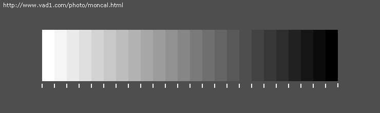
Firstly, make sure the brightness and contrast controls of your monitor are properly adjusted: you should see distinct borders between all gradations on the scale below (check last steps at its ends). Tip: set the contrast control at maximum. Owners of cheap flat-panel monitors can instead wiggle their heads around to find the best looking angle :).
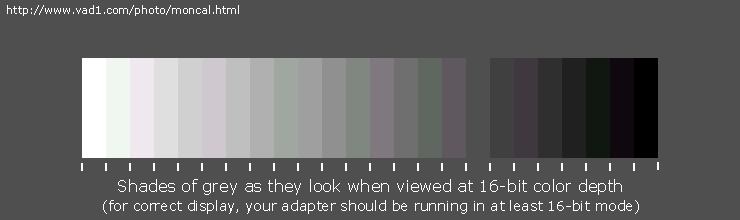
Secondly, your display adapter should be set at 24-bit color depth, also called millions of colors, 16777216 colors or True Color. Anything less will result in visible artefacts in continuous-tone areas of images, see example below.
|
| |
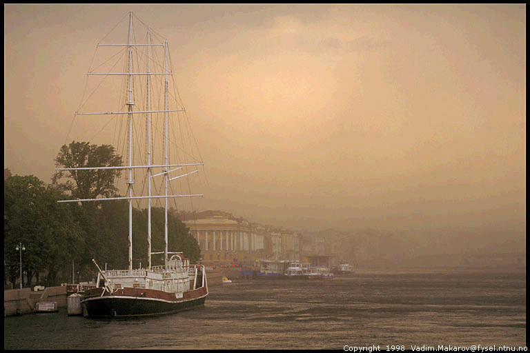
| Image as it looks in 32768 colors (15-bit mode). Note fine concentric bands in the sky; they are more visible at large sizes - click on the image | Normal image with smooth continuous tone. If it looks no different from the left image, your display adapter is definitely set incorrectly. The opposite may not hold; check your display settings even if it looks better. In 65536-color (16-bit) mode, bands would still be there, just less prominent |
Another sign of inferior color depth is if the gradations on the grayscale above are not completely neutral in color but take on slight random tints.
To check what video mode you are running in Windows 95/98/NT/2000, right-click on the desktop, choose Properties from the pop-up menu and click on the tab Settings. Unfortunately, you will probably be faced with a tradeoff between screen resolution, refresh frequency and color depth. Then you decide what is more important.
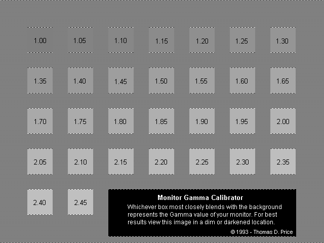
Still, due to the lamentable state of standartization on color and tonal reproduction on the Web, my JPEGs look differently on different monitors. I tried to make them look OK on a computer with an average video system, i. e. that with gamma of 1.8 to 2.2* (check your gamma*) and color temperature set a bit too high (bluish). By the way, recommended color temperature for image viewing and editing is 6500K, if that looks pleasantly on your monitor, of course.
Want to get into more detail? Look at Andrei Frolov's Calibrate Your System.
*The gamma value measured this way
depends on the pattern used to find it.
Horizontal line pattern
is considered more correct in comparison with the chessboard one I'm using here,
but there is no single opinion on it even among developers of image editors.
Horizontal line pattern is probably less dependent on the monitor dynamic response.